.webp)
Newcrest Primary Care
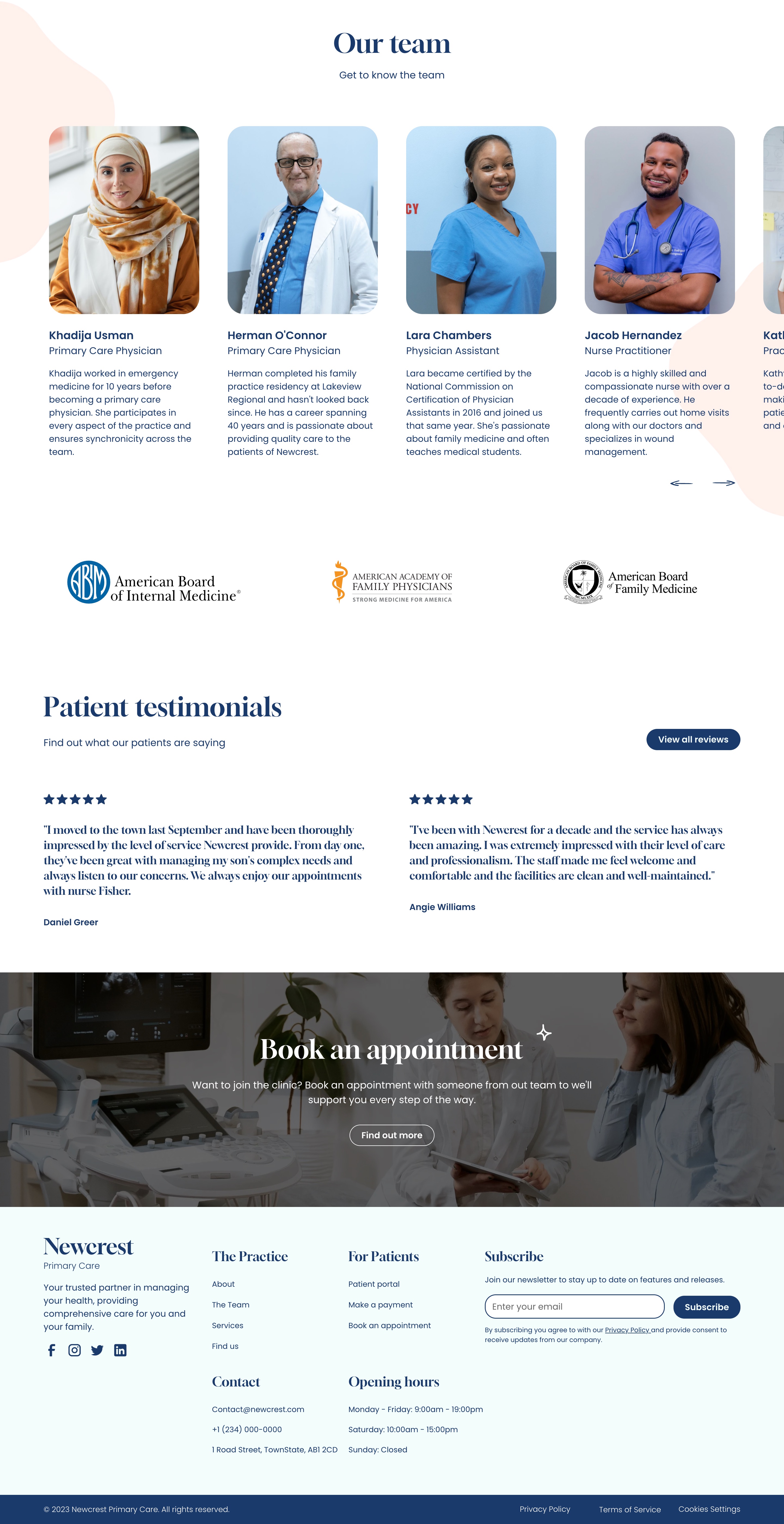
Newcrest Primary Care is a family medical practice project. The objectives involved producing a website that is highly informative and easy to navigate for new and existing patients. Users should easily be able to find important new regarding the practice and any changes to the service. It's also important that the website is easy to use but isn't overly clinical and engaging.
Challenge
Formulating an accessible, but friendly and engaging layout meant it was imperative to choose a colour scheme that didn't deviate too much for industry standards.
Upon doing research, I discovered that 85% of leading healthcare brands contained blue within their brand colours followed by white at 36% and black at 17%. There is strong evidence for the positive effects of using blue within healthcare branding so I chose to keep the primary colour within the industry standards and then accented them with a soft yet bold peach.


outcome
The layout of the website is clean and predictable with important practice news place above the fold at the top of the page. Team members and accreditation are visible a short scroll down the homepage so that trust is built early on for new patients.
The outcome is a website that is informative, minimalist and engaging to users of all ages and backgrounds. This helps strengthen the bond between healthcare providers and patients while leading to an increased patient / user satisfaction and engagement.


